Building a collapsible sidebar with Stimulus and Tailwind CSS
06 Jul 2021Today we’re building one of the most common elements in web design - a lefthand sidebar for navigation - using Tailwind CSS and Stimulus.js.
Our sidebar will always take up 100% of the height of the page and we’ll be able to expand and collapse the sidebar by clicking a button. The whole thing will be accomplished with just a bit of Stimulus for the expand/collapse action and a small amount of Tailwind in our markup.
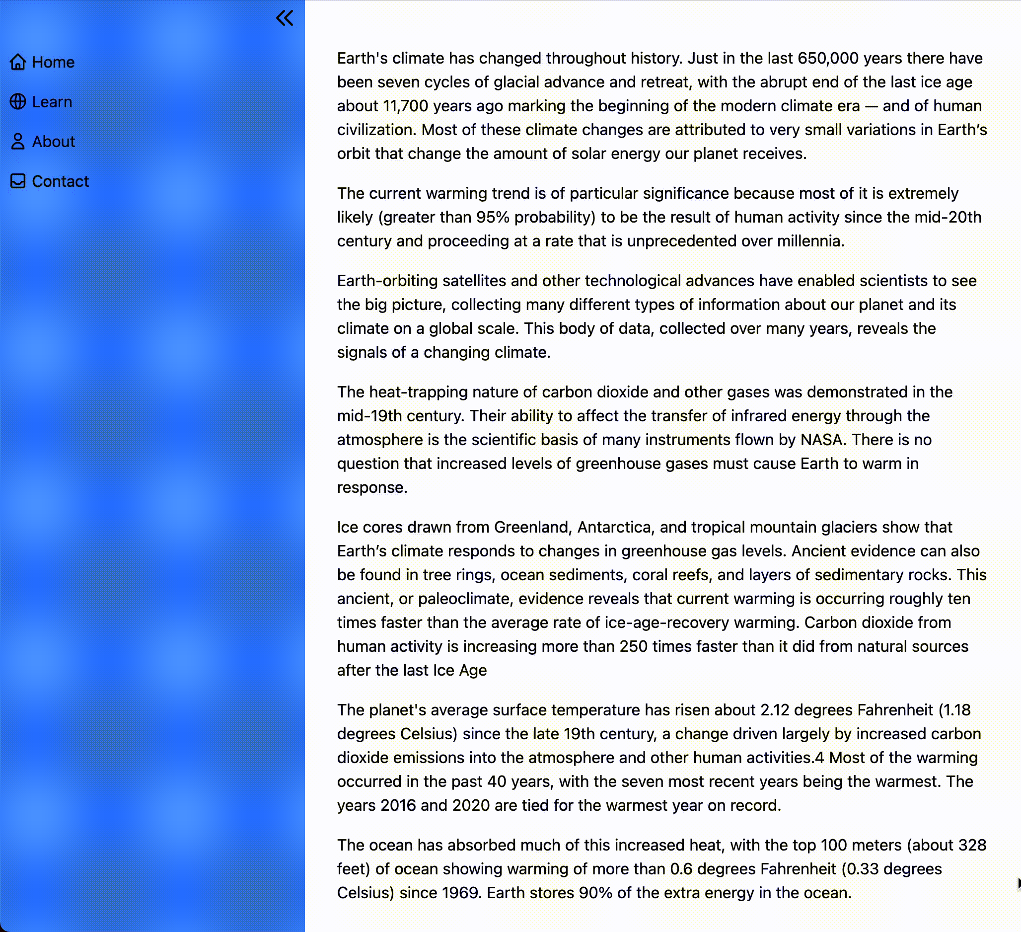
Here’s what it will look like when we’re finished.
To accomplish this, we’ll start with a plain HTML file, pull in Tailwind CSS to make things look nice, and use Stimulus for interactivity.
I’m writing this assuming a solid understanding of HTML and CSS, and some level of comfort with JavaScript.
If you’ve never seen Tailwind before, some of the classes we add for styling might feel a little odd. You don’t need any knowledge of how Stimulus works, but if you’re brand new you might want to read the Stimulus Handbook to help solidify some concepts as we go.
You can find the complete code for this project on Github.
Let’s dive in.
Project setup
For simplicity, we’re just going to use a plain old HTML file and pull in Tailwind and Stimulus from a CDN. In a real project, you should use a build system but we don’t need all that to demonstrate the concept!
Let’s start with our plain HTML. Go ahead and copy and paste the below into a file called sidebar.html
<!doctype html>
<html lang="en">
  <head>
    <meta charset="utf-8">
    <meta name="viewport" content="width=device-width, initial-scale=1">
    <title>Collapsible sidebar with Stimulus and Tailwind</title>
  </head>

  <body>
    <aside>
      Here's our sidebar, eventually
    </aside>
    <main>
      Here's where our main content lives
    </main>
  </body>
</html>
Now we’ll add in Stimulus and make Stimulus available through window.Stimulus. Add these script tags to the head tag, copied right from the Stimulus docs.
<script src="https://unpkg.com/stimulus/dist/stimulus.umd.js"></script>
<script>
  (() => {
    const application = Stimulus.Application.start()

    application.register("sidebar", class extends Stimulus.Controller {
      static get targets() {
        return [ "" ]
      }
    })
  })()
</script>
And then pull in Tailwind CSS from CDN, which is not recommended for uses outside of demos like this. Tailwind has extensive documentation for how to include Tailwind for just about any build system and framework you can imagine.
<link href="https://unpkg.com/tailwindcss@^2/dist/tailwind.min.css" rel="stylesheet">
Perfect, now when we open sidebar.html in our browser we should be able to access Stimulus in the JavaScript console and the defaults applied by Tailwind should be visible on our placeholder text.
Let’s create the sidebar layout with Tailwind now.
Building a static sidebar
Replace the <body> of your sidebar.html file with the below to add the basic structure of the sidebar to your page.
<body>
  <div class="container">
    <div class="flex">
      <aside class="sm:w-1/5 bg-blue-500 min-h-screen">
        <div class="sticky top-0 pt-12 px-2 w-full">
          <div class="absolute right-2 top-2 cursor-pointer">
            <svg xmlns="http://www.w3.org/2000/svg" class="h-6 w-6" fill="none" viewBox="0 0 24 24" stroke="currentColor">
              <path stroke-linecap="round" stroke-linejoin="round" stroke-width="2" d="M11 19l-7-7 7-7m8 14l-7-7 7-7" />
            </svg>
          </div>
          <nav>
            <ul class="flex flex-col overflow-hidden space-y-2">
              <li class="hover:text-gray-200 h-8">
                <a href="#" class="flex items-center h-8">
                  <svg xmlns="http://www.w3.org/2000/svg" class="h-5 w-5 mr-1 inline-block" fill="none" viewBox="0 0 24 24" stroke="currentColor" aria-hidden="true">
                    <path stroke-linecap="round" stroke-linejoin="round" stroke-width="2" d="M3 12l2-2m0 0l7-7 7 7M5 10v10a1 1 0 001 1h3m10-11l2 2m-2-2v10a1 1 0 01-1 1h-3m-6 0a1 1 0 001-1v-4a1 1 0 011-1h2a1 1 0 011 1v4a1 1 0 001 1m-6 0h6" />
                  </svg>
                  <span>
                    Home
                  </span>
                </a>
              </li>
              <li class="hover:text-gray-200 h-8">
                <a href="#" class="flex items-center h-8">
                  <svg xmlns="http://www.w3.org/2000/svg" class="h-5 w-5 mr-1" fill="none" viewBox="0 0 24 24" stroke="currentColor" aria-hidden="true">
                    <path stroke-linecap="round" stroke-linejoin="round" stroke-width="2" d="M21 12a9 9 0 01-9 9m9-9a9 9 0 00-9-9m9 9H3m9 9a9 9 0 01-9-9m9 9c1.657 0 3-4.03 3-9s-1.343-9-3-9m0 18c-1.657 0-3-4.03-3-9s1.343-9 3-9m-9 9a9 9 0 019-9" />
                  </svg>
                  <span>
                    Learn
                  </span>
                </a>
              </li>
              <li class="hover:text-gray-200 h-8">
                <a href="#" class="flex items-center h-8">
                  <svg xmlns="http://www.w3.org/2000/svg" class="h-5 w-5 mr-1" fill="none" viewBox="0 0 24 24" stroke="currentColor" aria-hidden="true">
                    <path stroke-linecap="round" stroke-linejoin="round" stroke-width="2" d="M16 7a4 4 0 11-8 0 4 4 0 018 0zM12 14a7 7 0 00-7 7h14a7 7 0 00-7-7z" />
                  </svg>
                  <span>
                    About
                  </span>
                </a>
              </li>
              <li class="flex items-center hover:text-gray-200 h-8">
                <a href="#" class="flex items-center h-8">
                  <svg xmlns="http://www.w3.org/2000/svg" class="h-5 w-5 mr-1" fill="none" viewBox="0 0 24 24" stroke="currentColor" aria-hidden="true">
                    <path stroke-linecap="round" stroke-linejoin="round" stroke-width="2" d="M20 13V6a2 2 0 00-2-2H6a2 2 0 00-2 2v7m16 0v5a2 2 0 01-2 2H6a2 2 0 01-2-2v-5m16 0h-2.586a1 1 0 00-.707.293l-2.414 2.414a1 1 0 01-.707.293h-3.172a1 1 0 01-.707-.293l-2.414-2.414A1 1 0 006.586 13H4" />
                  </svg>
                  <span>
                    Contact
                  </span>
                </a>
              </li>
            </ul>
          </nav>
        </div>
      </aside>
      <main class="sm:w-4/5 p-4">
        Main content goes here.
      </main>
    </div>
  </div>
</body>
This method of adding a static sidebar uses flexbox to create two side-by-side containers, with the smaller content on the left and the content on the right. Using Tailwind, we don’t need to touch CSS at all to create the layout, instead relying entirely on existing Tailwind utility classes.
Because we want the sidebar to have a background color that stretches (at minimum) the full height of the page, we add the min-h-screen class to the sidebar’s container. We want to keep the navigation links on the page at all times, even if the main content scrolls, so add the sticky class to the element that wraps the navigation menu.
Our navigation links each have an icon. When we have our collapse/expand functionality in place, the collapsed sidebar will display the link icons without any text.
With the body updated, refresh the page and see the basic layout in place. Clicking on the collapse/expand icon won’t do anything just yet.

Creating the sidebar Stimulus controller
The Stimulus controller will handle collapsing and expanding the sidebar content when the user clicks the collapse/expand icon.
First, we’ll add a function that toggles the sidebar from expanded to collapsed and back again. This function will look like this:
toggle() {
  if (this.sidebarContainerTarget.dataset.expanded === "1") {
    this.collapse()
  } else {
    this.expand()
  }
}
The toggle() function uses a simple if statement that checks a data attribute in the DOM to determine if the sidebar is currently expanded or collapsed and then call the collapse or expand function as appropriate. We’ll create this data attribute in the next section.
The collapse() function is responsible for collapsing the expanded sidebar, and it looks like this:
collapse() {
  this.sidebarContainerTarget.classList.remove("sm:w-1/5")
  this.iconTarget.innerHTML = `
  <svg xmlns="http://www.w3.org/2000/svg" class="h-6 w-6" fill="none" viewBox="0 0 24 24" stroke="currentColor">
    <path stroke-linecap="round" stroke-linejoin="round" stroke-width="2" d="M13 5l7 7-7 7M5 5l7 7-7 7" />
  </svg>
  `
  this.linkTargets.forEach(link => {
    link.classList.add("sr-only")
  })
  this.sidebarContainerTarget.dataset.expanded = "0"
}
Here we find the sidebar container, remove the width Tailwind class, swap out the icon for the expand icon, apply the Tailwind sr-only utility class to hide navigation link text from the page unless the user is accessing the site with a screenreader. Last, we update the sidebar’s expanded data attribute to 0, so that the next time the collapse/expand link is clicked the toggle function calls the expand function.
One of the wonderful things about Stimulus is that it provides a simple way to select elements from the DOM using targets. These targets take the place of selecting elements by class or id, instead relying on data attributes.
Using targets, we can keep our JavaScript and our HTML clear and readable, so that future developers don’t accidentally break our JavaScript by removing a class or changing an id.
The expand() function comes next, and it looks like this:
expand() {
  this.sidebarContainerTarget.classList.add("sm:w-1/5")
  this.iconTarget.innerHTML = `
    <svg xmlns="http://www.w3.org/2000/svg" class="h-6 w-6" fill="none" viewBox="0 0 24 24" stroke="currentColor">
      <path stroke-linecap="round" stroke-linejoin="round" stroke-width="2" d="M11 19l-7-7 7-7m8 14l-7-7 7-7" />
    </svg>
  `
  this.linkTargets.forEach(link => {
    link.classList.remove("sr-only")
  })
  this.sidebarContainerTarget.dataset.expanded = "1"
}
Here we simply reverse the changes our collapse function makes:
- Setting the sidebar width
- Swapping the icon
- Display link text to all users
- Set the expanded data attribute to 1 so the next click on the icon routes to collapse
Finally, we need to tell our Stimulus controller about the targets we’re using by updating the targets definition at the top of the Stimulus controller:
static get targets() {
  return [ "sidebarContainer", "icon", "link" ]
}
With these changes in place, the <script> tag that adds Stimulus to our page looks like this:
<script>
  (() => {
    const application = Stimulus.Application.start()

    application.register("sidebar", class extends Stimulus.Controller {
      static get targets() {
        return [ "sidebarContainer", "icon", "link" ]
      }

      toggle() {
        if (this.sidebarContainerTarget.dataset.expanded === "1") {
          this.collapse()
        } else {
          this.expand()
        }
      }

      collapse() {
        this.sidebarContainerTarget.classList.remove("sm:w-1/5")
        this.sidebarContainerTarget.dataset.expanded = "0"
        this.iconTarget.innerHTML = `
        <svg xmlns="http://www.w3.org/2000/svg" class="h-6 w-6" fill="none" viewBox="0 0 24 24" stroke="currentColor">
          <path stroke-linecap="round" stroke-linejoin="round" stroke-width="2" d="M13 5l7 7-7 7M5 5l7 7-7 7" />
        </svg>
        `
        this.linkTargets.forEach(link => {
          link.classList.add("sr-only")
        })
      }

      expand() {
        this.sidebarContainerTarget.classList.add("sm:w-1/5")
        this.sidebarContainerTarget.dataset.expanded = "1"
        this.iconTarget.innerHTML = `
          <svg xmlns="http://www.w3.org/2000/svg" class="h-6 w-6" fill="none" viewBox="0 0 24 24" stroke="currentColor">
            <path stroke-linecap="round" stroke-linejoin="round" stroke-width="2" d="M11 19l-7-7 7-7m8 14l-7-7 7-7" />
          </svg>
        `
        this.linkTargets.forEach(link => {
          link.classList.remove("sr-only")
        })
      }
    })
  })()
</script>
If you make these updates, refresh the page and click on the collapse icon you’ll notice that absolutely nothing happens. That’s because our Stimulus controller isn’t connected to the DOM yet. We’ll finish up this guide by updating our HTML to make everything work.
Connecting to the DOM
For our Stimulus controller to work, we first need to add a controller data attribute somewhere in the HTML. In general, you want to attach the controller to the parent element for the part of the DOM you plan to change within the controller. Since the Sidebar controller makes changes to the sidebar and the elements inside of the sidebar, it makes sense to attach the controller to the top-level sidebar element:
<aside data-controller="sidebar" class="sm:w-1/5 bg-blue-500 min-h-screen">
  <!-- Sidebar content -->
</aside>
Next up, we need a data attribute to track the current state of the sidebar (expanded or collapsed):
<aside data-sidebar-target="sidebarContainer" data-expanded="1" class="sm:w-1/5 bg-blue-500 min-h-screen">
  <!-- Sidebar content -->
</aside>
The last update to the <aside> element is to tell our Stimulus controller that it is the sidebarContainer target:
<aside data-sidebar-target="sidebarContainer" data-expanded="1" data-controller="sidebar" class="sm:w-1/5 bg-blue-500 min-h-screen">
  <!-- Sidebar content -->
</aside>
Next up, our collapse icon container needs a target and an action:
<div data-action="click->sidebar#toggle" data-sidebar-target="icon" class="absolute right-2 top-2 cursor-pointer">
  <svg xmlns="http://www.w3.org/2000/svg" class="h-6 w-6" fill="none" viewBox="0 0 24 24" stroke="currentColor">
    <path stroke-linecap="round" stroke-linejoin="round" stroke-width="2" d="M11 19l-7-7 7-7m8 14l-7-7 7-7" />
  </svg>
</div>
The data-action attribute is structured as “UserAction -> ControllerName#FunctionName”. For certain elements and actions, the UserAction component is optional but for a div, an action must always be provided. Read more about actions here.
With these attributes in place, each time the sidebar icon is clicked, the toggle() function defined in our Sidebar controller will be called. If you refresh the page now you’ll notice an error in your JavaScript console. One last addition to the HTML and we’ll be all set:
<nav>
  <ul class="flex flex-col overflow-hidden space-y-2">
    <li class="hover:text-gray-200 h-8">
      <a href="#" class="flex items-center h-8">
        <svg xmlns="http://www.w3.org/2000/svg" class="h-5 w-5 mr-1 inline-block" fill="none" viewBox="0 0 24 24" stroke="currentColor" aria-hidden="true">
          <path stroke-linecap="round" stroke-linejoin="round" stroke-width="2" d="M3 12l2-2m0 0l7-7 7 7M5 10v10a1 1 0 001 1h3m10-11l2 2m-2-2v10a1 1 0 01-1 1h-3m-6 0a1 1 0 001-1v-4a1 1 0 011-1h2a1 1 0 011 1v4a1 1 0 001 1m-6 0h6" />
        </svg>
        <span data-sidebar-target="link">
          Home
        </span>
      </a>
    </li>
    <li class="hover:text-gray-200 h-8">
      <a href="#" class="flex items-center h-8">
        <svg xmlns="http://www.w3.org/2000/svg" class="h-5 w-5 mr-1" fill="none" viewBox="0 0 24 24" stroke="currentColor" aria-hidden="true">
          <path stroke-linecap="round" stroke-linejoin="round" stroke-width="2" d="M21 12a9 9 0 01-9 9m9-9a9 9 0 00-9-9m9 9H3m9 9a9 9 0 01-9-9m9 9c1.657 0 3-4.03 3-9s-1.343-9-3-9m0 18c-1.657 0-3-4.03-3-9s1.343-9 3-9m-9 9a9 9 0 019-9" />
        </svg>
        <span data-sidebar-target="link">
          Learn
        </span>
      </a>
    </li>
    <li class="hover:text-gray-200 h-8">
      <a href="#" class="flex items-center h-8">
        <svg xmlns="http://www.w3.org/2000/svg" class="h-5 w-5 mr-1" fill="none" viewBox="0 0 24 24" stroke="currentColor" aria-hidden="true">
          <path stroke-linecap="round" stroke-linejoin="round" stroke-width="2" d="M16 7a4 4 0 11-8 0 4 4 0 018 0zM12 14a7 7 0 00-7 7h14a7 7 0 00-7-7z" />
        </svg>
        <span data-sidebar-target="link">
          About
        </span>
      </a>
    </li>
    <li class="flex items-center hover:text-gray-200 h-8">
      <a href="#" class="flex items-center h-8">
        <svg xmlns="http://www.w3.org/2000/svg" class="h-5 w-5 mr-1" fill="none" viewBox="0 0 24 24" stroke="currentColor" aria-hidden="true">
          <path stroke-linecap="round" stroke-linejoin="round" stroke-width="2" d="M20 13V6a2 2 0 00-2-2H6a2 2 0 00-2 2v7m16 0v5a2 2 0 01-2 2H6a2 2 0 01-2-2v-5m16 0h-2.586a1 1 0 00-.707.293l-2.414 2.414a1 1 0 01-.707.293h-3.172a1 1 0 01-.707-.293l-2.414-2.414A1 1 0 006.586 13H4" />
        </svg>
        <span data-sidebar-target="link">
          Contact
        </span>
      </a>
    </li>
  </ul>
</nav>
Here we added sidebar-target="link" to each of the span’s that wrap the link text. Recall that in our Stimulus controller we use linkTargets to toggle the sr-only class as needed. This ability to easily find and modify any number of elements without relying on classes that may or may not be changed in the future is one of the things that makes Stimulus so pleasant to work with.
this.linkTargets.forEach(link => {
  link.classList.add("sr-only")
})
With that last change in place, refresh the page one last time and see that everything works as expected.
Wrapping up
Today we learned how to use Tailwind CSS and Stimulus to create a simple sidebar that users can collapse and expand on demand.
While both a sidebar layout and collapsing/expanding content can be accomplished without any CSS or JavaScript frameworks, I hope this example has given you a taste for how readable, maintainable, and scalable Tailwind and Stimulus can be. A future developer revisiting code written with Stimulus and Tailwind can quickly deduce the purpose of each class and data attribute and can confidently make changes to implement new features to expand the site over time.
We’re just scratching the surface of what Tailwind and Stimulus can do. To dig in further, start with:
- Tailwind’s excellent (really, excellent) documentation
- The Stimulus Handbook
- Better Stimulus for Stimulus patterns and best practices
Thanks for reading!
About the author:
I’m David - a solo founder and consultant. I write about software engineering, Ruby on Rails and the Rails-y ecosystem, product management, and the lessons I learn as I work to build sustainable SaaS businesses.
My current project is Vestimonials, an async video communication tool to help companies collect and share video testimonials from their employees and customers. I’m available for Rails, product management, and strategy consulting. Get in touch if you have questions about this article or anything else that’s on your mind.