Building a horizontal slider with Stimulus and Tailwind CSS
06 May 2021Today we’re building a component that is common but deceptively tricky to get right - a horizontal slider with a position indicator and navigation buttons.
We’ll have a list of items of an arbitrary length, and our slider will allow folks to scroll to see every item in the list. As they scroll, indicators below the slider will update to show which items are visible on the screen. Clicking on the indicators will scroll the corresponding item into view. The whole thing is pretty fancy.
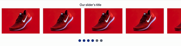
Here’s what it will look like when we’re finished.
To accomplish this, we’ll start with a plain HTML file, pull in Tailwind CSS to make things look nice, and use Stimulus to build interactivity for our position indicators and navigation buttons.
I’m writing this assuming a solid understanding of HTML and CSS, and some level of comfort with JavaScript. If you’ve never seen Tailwind before, some of the classes we add for styling might feel a little odd. You don’t need any knowledge of how Stimulus works, but if you’re brand new you might want to read the Stimulus Handbook to help solidify some concepts.
Let’s dive in.
Project setup
For simplicity, we’re just going to use a plain old HTML file and pull in Tailwind and Stimulus from a CDN. In a real project, you should probably use a build system but we don’t need all that to demonstrate the concept!
Let’s start with our plain HTML. Go ahead and copy and paste the below into a file called slider.html or use a more exciting name. You’re the boss.
<!doctype html>
<html lang="en">
  <head>
    <meta charset="utf-8">
    <meta name="viewport" content="width=device-width, initial-scale=1">
    <title>Horizontal slider with Stimulus and Tailwind</title>
  </head>

  <body>
    <main>
      Here's where our slider will go, momentarily.
    </main>
  </body>
</html>
Now we’ll add in Stimulus and make Stimulus available through window.Stimulus. Add these script tags to the head tag, copied right from the Stimulus docs.
<script src="https://unpkg.com/stimulus/dist/stimulus.umd.js"></script>
<script>
  (() => {
    const application = Stimulus.Application.start()

    application.register("slider", class extends Stimulus.Controller {
      static get targets() {
        return [ "" ]
      }
    })
  })()
</script>
And then pull in Tailwind CSS from CDN, which is not recommended for uses outside of demos like this. Tailwind has extensive documentation for how to include Tailwind for just about any build system and framework you can imagine.
<link href="https://unpkg.com/tailwindcss@^2/dist/tailwind.min.css" rel="stylesheet">
Perfect, now when we open our slider.html we should be able to access window.Stimulus in the JavaScript console and the defaults applied by Tailwind should be visible on our placeholder text.
Let’s build the slider with Tailwind now.
Create our horizontal slider
We’ll start with the basic structure of the slider, with no Tailwind classes, and then we’ll add in the Tailwind classes to make everything function. Replace the text in <main> with the HTML below.
<div id="container">
  <h1>Our slider's title</h1>
  <div id="scrolling-content">
    <div>
      <img src="https://images.unsplash.com/photo-1542291026-7eec264c27ff?ixid=MnwxMjA3fDB8MHxzZWFyY2h8MXx8c2hvZXN8ZW58MHx8MHx8&ixlib=rb-1.2.1&auto=format&fit=crop&w=900&q=60" />
    </div>
    <div>
      <img src="https://images.unsplash.com/photo-1542291026-7eec264c27ff?ixid=MnwxMjA3fDB8MHxzZWFyY2h8MXx8c2hvZXN8ZW58MHx8MHx8&ixlib=rb-1.2.1&auto=format&fit=crop&w=900&q=60" />
    </div>
    <div>
      <img src="https://images.unsplash.com/photo-1542291026-7eec264c27ff?ixid=MnwxMjA3fDB8MHxzZWFyY2h8MXx8c2hvZXN8ZW58MHx8MHx8&ixlib=rb-1.2.1&auto=format&fit=crop&w=900&q=60" />
    </div>
    <div>
      <img src="https://images.unsplash.com/photo-1542291026-7eec264c27ff?ixid=MnwxMjA3fDB8MHxzZWFyY2h8MXx8c2hvZXN8ZW58MHx8MHx8&ixlib=rb-1.2.1&auto=format&fit=crop&w=900&q=60" />
    </div>
    <div>
      <img src="https://images.unsplash.com/photo-1542291026-7eec264c27ff?ixid=MnwxMjA3fDB8MHxzZWFyY2h8MXx8c2hvZXN8ZW58MHx8MHx8&ixlib=rb-1.2.1&auto=format&fit=crop&w=900&q=60" />
    </div>
    <div>
      <img src="https://images.unsplash.com/photo-1542291026-7eec264c27ff?ixid=MnwxMjA3fDB8MHxzZWFyY2h8MXx8c2hvZXN8ZW58MHx8MHx8&ixlib=rb-1.2.1&auto=format&fit=crop&w=900&q=60" />
    </div>
  </div>
</div>
Open up slider.html and you’ll see some giant pictures of shoes. Not quite what we want, but a good starting point.
We’ll start with a flex container to hold our slider’s header, which will be static, and the slider itself, which will scroll horizontally. Update the content of <main> to include some basic container classes.
<div id="container" class="flex flex-col my-24">
  <h1 class="text-3xl text-gray-900 text-center mb-4">Our slider's title</h1>
  <div id="scrolling-content" class="flex overflow-x-scroll">
    <div class="w-96 h-64 px-4 flex-shrink-0">
      <img src="https://images.unsplash.com/photo-1542291026-7eec264c27ff?ixid=MnwxMjA3fDB8MHxzZWFyY2h8MXx8c2hvZXN8ZW58MHx8MHx8&ixlib=rb-1.2.1&auto=format&fit=crop&w=900&q=60" />
    </div>
    <div class="w-96 h-64 px-4 flex-shrink-0">
      <img src="https://images.unsplash.com/photo-1542291026-7eec264c27ff?ixid=MnwxMjA3fDB8MHxzZWFyY2h8MXx8c2hvZXN8ZW58MHx8MHx8&ixlib=rb-1.2.1&auto=format&fit=crop&w=900&q=60" />
    </div>
    <div class="w-96 h-64 px-4 flex-shrink-0">
      <img src="https://images.unsplash.com/photo-1542291026-7eec264c27ff?ixid=MnwxMjA3fDB8MHxzZWFyY2h8MXx8c2hvZXN8ZW58MHx8MHx8&ixlib=rb-1.2.1&auto=format&fit=crop&w=900&q=60" />
    </div>
    <div class="w-96 h-64 px-4 flex-shrink-0">
      <img src="https://images.unsplash.com/photo-1542291026-7eec264c27ff?ixid=MnwxMjA3fDB8MHxzZWFyY2h8MXx8c2hvZXN8ZW58MHx8MHx8&ixlib=rb-1.2.1&auto=format&fit=crop&w=900&q=60" />
    </div>
    <div class="w-96 h-64 px-4 flex-shrink-0">
      <img src="https://images.unsplash.com/photo-1542291026-7eec264c27ff?ixid=MnwxMjA3fDB8MHxzZWFyY2h8MXx8c2hvZXN8ZW58MHx8MHx8&ixlib=rb-1.2.1&auto=format&fit=crop&w=900&q=60" />
    </div>
    <div class="w-96 h-64 px-4 flex-shrink-0">
      <img src="https://images.unsplash.com/photo-1542291026-7eec264c27ff?ixid=MnwxMjA3fDB8MHxzZWFyY2h8MXx8c2hvZXN8ZW58MHx8MHx8&ixlib=rb-1.2.1&auto=format&fit=crop&w=900&q=60" />
    </div>
  </div>
</div>
The really important changes here are:
- Adding
flex overflow-x-scrollto thescrolling-contentdiv. That sets the div to flex the child divs and adds the horizontal scrolling behavior we’re looking for with the CSS propertyoverflow-x: scroll - Setting
flex-shrink-0to the individual image divs. This ensures the image divs don’t resize themselves to fit the viewport width using the CSS propertyflex-shrink: 0. Without this, the image divs would shrink automatically and the overflow-x-scroll property on thescrolling-contentdiv wouldn’t do anything useful.
At this point, we’ve got a simple scrolling image gallery, nice work! Now we’ll get into JavaScript land by adding indicators that show the user which images are currently on screen and that function as navigation buttons to scroll the content to the clicked indicator.
Add navigation indicators
Our indicators will be circles that change color based on whether they are in the active viewport or not. Again, we’ll start with our HTML. Add this HTML to the bottom of the container div.
<div class="flex mx-auto my-8">
  <ul class="flex justify-center">
    <!-- Note that we have one <li> for each image in our gallery -->
    <li class="h-6 w-6 rounded-full mx-2 cursor-pointer bg-gray-500"></li>
    <li class="h-6 w-6 rounded-full mx-2 cursor-pointer bg-gray-500"></li>
    <li class="h-6 w-6 rounded-full mx-2 cursor-pointer bg-gray-500"></li>
    <li class="h-6 w-6 rounded-full mx-2 cursor-pointer bg-gray-500"></li>
    <li class="h-6 w-6 rounded-full mx-2 cursor-pointer bg-gray-500"></li>
    <li class="h-6 w-6 rounded-full mx-2 cursor-pointer bg-gray-500"></li>
  </ul>
</div>
Now we’ve got some nice looking circles below our scrolling images, but they don’t serve any purpose. Next up is creating a Stimulus controller to make the dots come to life.
Bring the indicators to life with Stimulus
The Stimulus controller will be responsible for two things:
- Updating the color of the indicator circles based on whether or not the corresponding image is currently visible to the user
- Handling clicks on indicators and scrolling the container to the corresponding image
For the first task, we’ll rely on the IntersectionObserver API. This API is well-supported across modern browsers and is commonly used for tasks like lazy-loading images. In our case, we’re going to use it to change the color of the indicator circles. Let’s get started.
Update the Stimulus controller currently defined in our head with the following:
<script>
  (() => {
    const application = Stimulus.Application.start()

    application.register("slider", class extends Stimulus.Controller {
      static get targets() {
        return [ "scrollContainer", "image", "indicator" ]
      }
      initialize() {
        this.observer = new IntersectionObserver(this.onIntersectionObserved.bind(this), {
          root: this.scrollContainerTarget,
          threshold: 0.5
        })
        this.imageTargets.forEach(image => {
          this.observer.observe(image)
        })
      }

      onIntersectionObserved(entries) {
        entries.forEach(entry => {
          if (entry.intersectionRatio > 0.5) {
            const intersectingIndex = this.imageTargets.indexOf(entry.target)
            this.indicatorTargets[intersectingIndex].classList.add("bg-blue-900")
          }
          else {
            const intersectingIndex = this.imageTargets.indexOf(entry.target)
            this.indicatorTargets[intersectingIndex].classList.remove("bg-blue-900")
          }
        })
      }
    })
  })()
</script>
There’s a lot here, let’s break it down a bit.
First, we add a few targets to our controller. We’ll use these to reference DOM elements that our controller cares about.
In the initialize method, we create a new observer using the IntersectionObserver constructor. The onIntersectionObserved callback function passed to the constructor is the function that will be called each time a visibility threshold is crossed.
In (closer-to) human terms: as you scroll the images left or right, the observer watches the visible part of the screen and fires the onIntersectionObserver function each time an image is more (or less) than half visible on the screen.
Also note that we bind this to the onIntersectionObserved function so that we can reference this and get back our Stimulus controller inside of the onIntersectionObserved function. Without binding this we would not be able to use Stimulus targets in this function and our JavaScript would be a bit more complicated.
At the end of the initialize method, we tell our observer which DOM elements it should watch over.
The onIntersectionObserved function simply loops over all of the watched DOM elements and adds a class if the element is more than half visible or removes that class if the element is not.
With this JavaScript added, refresh slider.html and see that nothing happens. To make this work, we need to update the HTML to connect the Stimulus controller to the DOM.
Let’s update our HTML as follows:
<div class="flex flex-col my-24" data-controller="slider">
  <h1 class="text-3xl text-gray-900 text-center mb-4">Our slider's title</h1>
  <div class="flex overflow-x-scroll" data-slider-target="scrollContainer">
    <div class="w-96 h-64 px-4 flex-shrink-0" data-slider-target="image">
      <img src="https://images.unsplash.com/photo-1542291026-7eec264c27ff?ixid=MnwxMjA3fDB8MHxzZWFyY2h8MXx8c2hvZXN8ZW58MHx8MHx8&ixlib=rb-1.2.1&auto=format&fit=crop&w=900&q=60" />
    </div>
    <div class="w-96 h-64 px-4 flex-shrink-0" data-slider-target="image">
      <img src="https://images.unsplash.com/photo-1542291026-7eec264c27ff?ixid=MnwxMjA3fDB8MHxzZWFyY2h8MXx8c2hvZXN8ZW58MHx8MHx8&ixlib=rb-1.2.1&auto=format&fit=crop&w=900&q=60" />
    </div>
    <div class="w-96 h-64 px-4 flex-shrink-0" data-slider-target="image">
      <img src="https://images.unsplash.com/photo-1542291026-7eec264c27ff?ixid=MnwxMjA3fDB8MHxzZWFyY2h8MXx8c2hvZXN8ZW58MHx8MHx8&ixlib=rb-1.2.1&auto=format&fit=crop&w=900&q=60" />
    </div>
    <div class="w-96 h-64 px-4 flex-shrink-0" data-slider-target="image">
      <img src="https://images.unsplash.com/photo-1542291026-7eec264c27ff?ixid=MnwxMjA3fDB8MHxzZWFyY2h8MXx8c2hvZXN8ZW58MHx8MHx8&ixlib=rb-1.2.1&auto=format&fit=crop&w=900&q=60" />
    </div>
    <div class="w-96 h-64 px-4 flex-shrink-0" data-slider-target="image">
      <img src="https://images.unsplash.com/photo-1542291026-7eec264c27ff?ixid=MnwxMjA3fDB8MHxzZWFyY2h8MXx8c2hvZXN8ZW58MHx8MHx8&ixlib=rb-1.2.1&auto=format&fit=crop&w=900&q=60" />
    </div>
    <div class="w-96 h-64 px-4 flex-shrink-0" data-slider-target="image">
      <img src="https://images.unsplash.com/photo-1542291026-7eec264c27ff?ixid=MnwxMjA3fDB8MHxzZWFyY2h8MXx8c2hvZXN8ZW58MHx8MHx8&ixlib=rb-1.2.1&auto=format&fit=crop&w=900&q=60" />
    </div>
  </div>
  <div class="flex mx-auto my-8">
    <ul class="flex justify-center">
      <li class="h-6 w-6 rounded-full mx-2 cursor-pointer bg-gray-500" data-slider-target="indicator"></li>
      <li class="h-6 w-6 rounded-full mx-2 cursor-pointer bg-gray-500" data-slider-target="indicator"></li>
      <li class="h-6 w-6 rounded-full mx-2 cursor-pointer bg-gray-500" data-slider-target="indicator"></li>
      <li class="h-6 w-6 rounded-full mx-2 cursor-pointer bg-gray-500" data-slider-target="indicator"></li>
      <li class="h-6 w-6 rounded-full mx-2 cursor-pointer bg-gray-500" data-slider-target="indicator"></li>
      <li class="h-6 w-6 rounded-full mx-2 cursor-pointer bg-gray-500" data-slider-target="indicator"></li>
    </ul>
  </div>
</div>
The changes here are:
- We added
data-controller="slider"to our wrapper div to tell Stimulus that this div should be tied to ourSliderController. - We added
data-slider-target="scrollContainer"to the div that wraps our images and scrolls on the x-axis. - We added
data-slider-target="image"to each of the image divs. - We added
data-slider-target="indicator"to each of the indicator <li> tags
The addition of data-controller="slider" is mandatory - without adding this declaration our Stimulus code will never be executed. The targets are all technically optional and you could accomplish the same by adding classes or ids to the DOM but targets are a super helpful way to keep your code clean and concise and if you’re using Stimulus you should be using targets to reference DOM elements in most cases.
If you refresh slider.html again, you’ll see that the circles change color as we slide images in and out of view. Resize the browser, get wild with it if you want. One more step to go.
Add onClick navigation
Now that we’ve got these nice navigation circles, the last step is to allow users to navigate between images by clicking on the corresponding circle. This can be accomplished with a new method in our Stimulus controller:
// Add this function alongside the existing initialize and onIntersectionObserved functions
scrollTo() {
  const imageId = event.target.dataset.imageId
  const imageElement = document.getElementById(imageId)
  imageElement.scrollIntoView({ block: "end", inline: "nearest", behavior: "smooth" })
}
This new function starts by identifying the target image and then uses Element.scrollIntoView() to scroll the parent container into the viewport, if it is not already visible.
To make this work, we need to add appropriate attributes to the images and indicators HTML, like this:
<div class="flex flex-col my-24" data-controller="slider">
  <h1 class="text-3xl text-gray-900 text-center mb-4">Our slider's title</h1>
  <div class="flex overflow-x-scroll" data-slider-target="scrollContainer">
    <div class="w-96 h-64 px-4 flex-shrink-0" data-slider-target="image" id="1">
      <img src="https://images.unsplash.com/photo-1542291026-7eec264c27ff?ixid=MnwxMjA3fDB8MHxzZWFyY2h8MXx8c2hvZXN8ZW58MHx8MHx8&ixlib=rb-1.2.1&auto=format&fit=crop&w=900&q=60" />
    </div>
    <div class="w-96 h-64 px-4 flex-shrink-0" data-slider-target="image" id="2">
      <img src="https://images.unsplash.com/photo-1542291026-7eec264c27ff?ixid=MnwxMjA3fDB8MHxzZWFyY2h8MXx8c2hvZXN8ZW58MHx8MHx8&ixlib=rb-1.2.1&auto=format&fit=crop&w=900&q=60" />
    </div>
    <div class="w-96 h-64 px-4 flex-shrink-0" data-slider-target="image" id="3">
      <img src="https://images.unsplash.com/photo-1542291026-7eec264c27ff?ixid=MnwxMjA3fDB8MHxzZWFyY2h8MXx8c2hvZXN8ZW58MHx8MHx8&ixlib=rb-1.2.1&auto=format&fit=crop&w=900&q=60" />
    </div>
    <div class="w-96 h-64 px-4 flex-shrink-0" data-slider-target="image" id="4">
      <img src="https://images.unsplash.com/photo-1542291026-7eec264c27ff?ixid=MnwxMjA3fDB8MHxzZWFyY2h8MXx8c2hvZXN8ZW58MHx8MHx8&ixlib=rb-1.2.1&auto=format&fit=crop&w=900&q=60" />
    </div>
    <div class="w-96 h-64 px-4 flex-shrink-0" data-slider-target="image" id="5">
      <img src="https://images.unsplash.com/photo-1542291026-7eec264c27ff?ixid=MnwxMjA3fDB8MHxzZWFyY2h8MXx8c2hvZXN8ZW58MHx8MHx8&ixlib=rb-1.2.1&auto=format&fit=crop&w=900&q=60" />
    </div>
    <div class="w-96 h-64 px-4 flex-shrink-0" data-slider-target="image" id="6">
      <img src="https://images.unsplash.com/photo-1542291026-7eec264c27ff?ixid=MnwxMjA3fDB8MHxzZWFyY2h8MXx8c2hvZXN8ZW58MHx8MHx8&ixlib=rb-1.2.1&auto=format&fit=crop&w=900&q=60" />
    </div>
  </div>
  <div class="flex mx-auto my-8">
    <ul class="flex justify-center">
      <li class="h-6 w-6 rounded-full mx-2 cursor-pointer bg-gray-500" data-slider-target="indicator" data-image-id="1" data-action="click->slider#scrollTo"></li>
      <li class="h-6 w-6 rounded-full mx-2 cursor-pointer bg-gray-500" data-slider-target="indicator" data-image-id="2" data-action="click->slider#scrollTo"></li>
      <li class="h-6 w-6 rounded-full mx-2 cursor-pointer bg-gray-500" data-slider-target="indicator" data-image-id="3" data-action="click->slider#scrollTo"></li>
      <li class="h-6 w-6 rounded-full mx-2 cursor-pointer bg-gray-500" data-slider-target="indicator" data-image-id="4" data-action="click->slider#scrollTo"></li>
      <li class="h-6 w-6 rounded-full mx-2 cursor-pointer bg-gray-500" data-slider-target="indicator" data-image-id="5" data-action="click->slider#scrollTo"></li>
      <li class="h-6 w-6 rounded-full mx-2 cursor-pointer bg-gray-500" data-slider-target="indicator" data-image-id="6" data-action="click->slider#scrollTo"></li>
    </ul>
  </div>
</div>
Note the changes here. Each image container div is given an id and each indicator is given a corresponding data-image-id. In the scrollTo function, we use data-image-id in a vanilla JavaScript document.getElementById call. The assigned ids are arbitrary - you could give each image a name or use a random string, as long as the image-id data attribute on the indicator matches the id on the image, you’re good to go.
After adding the ids, we also added data-actions to each indicator. The data-action attribute tells Stimulus which function to call when the click action occurs on the element. For more details on how data-action works, the Stimulus Handbook is a great starting point!
Refresh the page one more time and click on a circle for an image that isn’t on screen and your browser should scroll until that image is visible. Magic!
Improving scrollTo
While our scrollTo method works fine in isolation right now, if our slider element isn’t the only thing on the page, folks will have a fairly jarring experience - clicking on a dot will scroll the page horizontally (good!) and vertically (weird!).
This happens because scrollIntoView assumes you need to scroll both horizontally and vertically. You can’t only scroll horizontally with this function. This works great for full screen experiences where your slider is the only content on the page (like a full screen image gallery) but it fails when your slider has other content above and below it (like a gallery of product images on an ecommerce store listing)
To workaround this limitation, we can replace scrollIntoView with scrollTo. scrollTo allows us to scroll an element to a given x and y coordinate pair but, crucially, you can choose to only provide an x coordinate, eliminating any weird vertical scrolling.
Let’s update our scrollTo Stimulus function to use scrollTo instead of scrollIntoView:
scrollTo() {
  const imageId = event.target.dataset.imageId
  const imageElement = document.getElementById(imageId)
  const imageCoordinates = imageElement.getBoundingClientRect()
  this.scrollContainerTarget.scrollTo({ left: (this.scrollContainerTarget.scrollLeft + imageCoordinates.left), top: false, behavior: "smooth" })
}
Our new function has two key changes:
- First, we extract the current position of our image relative to the viewport with getBoundingClientRect. This function returns, among other things, the x and y position of the element.
- Next, we replace
scrollIntoViewwithscrollTo. In the options, we settopto false to indicate we don’t want to change the vertical scroll and setleftto the current left scroll position of thescrollContainer+ the the image’sleft(orx) position. Combining the current scroll position and the target element’s x position allows us to reliably scroll the container left and right programatically.
With this update in place, navigating the scroll container by clicking on the indicator circles no longer causes vertical scrolling.
Bonus round: Scroll behavior improvements
To finish up, let’s add a few more CSS rules to our slider to make it look and feel a little nicer.
First, we can add the hide-scroll-bar class to our scroll container. This built-in Tailwind CSS class hides the scroll bar, which looks a bit nicer and isn’t necessary with our indicators in place.
Next, we can prevent unwanted back navigation on mobile devices by adding the overscroll-x-contain class to the scroll container. Another built-in Tailwind class, this stops overscrolling in the scroll container (like swiping too aggressively to the left) from triggering scrolling on the whole page.
Finally, we’ll step outside of Tailwind for some scroll behavior CSS rules. Add a style tag to the head in slider.html and add the following CSS:
<style type="text/css">
  .gallery-item {
    scroll-snap-align: start;
  }
  .gallery {
    -webkit-overflow-scrolling: touch;
    scroll-snap-type: x mandatory;
  }
</style>
These rules instruct the browser to snap scrolling to each element with scroll-snap-type, adds momentum based scrolling on touch devices with -webkit-overflow-scrolling and tells the browser where to snap to for each gallery item with scroll-snap-align.
Add the gallery class to the scroll container and gallery-item to each image div and notice that scrolling the container now nicely snaps to each element when scrolling finishes.
Wrapping up and further reading
Some caveats to note before you use this code in production: at the time of this writing intersectionObserver and scrollTo are not implemented on IE11 and Safari does not support scrollTo options. You may wish to adjust the scrollTo function call to not pass in options or add polyfills for support on IE11, depending on your needs.
Special thanks goes to Joost Kiens who wrote an excellent article on using the intersectionObserver API to build an single element scroll container that served as a base for what we built today.
You can find the complete code for this guide on Github.
For questions or comments, you can find me on Twitter.
If you want to learn more about Tailwind or Stimulus, the official documentation for both is a great place to start. In particular, Tailwind’s documentation is some of the best on the internet and is highly recommended if you want to learn more about how Tailwind works.
Thanks for reading!